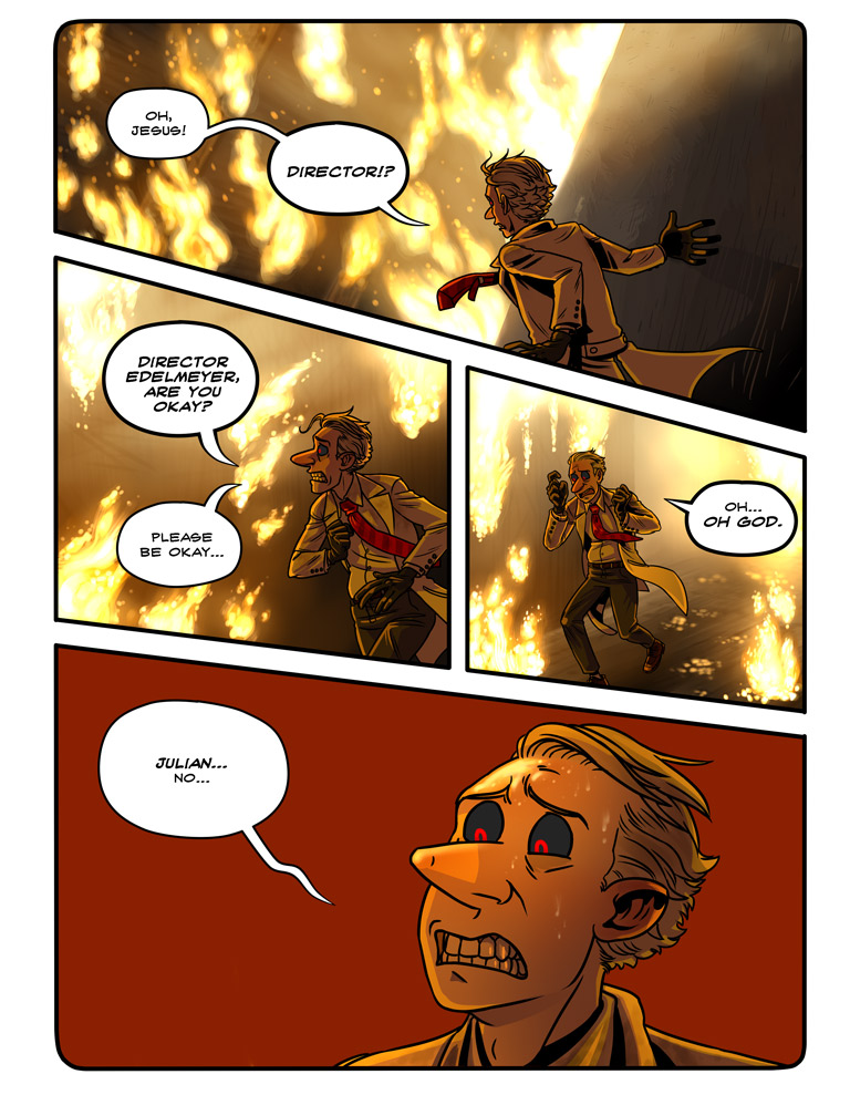
Chp 3 Epilogue Page One
I was going to upload this epilogue as one long page, but my archives hate that. I might do the next part as a long page, though. Next part should be up tomorrow.
BTW did you know you can click on the chapter cover thumbnails on my archives page and it takes you to a page with the whole chapter thumbnailed out for easy perusal? I keep meaning to add text to the archive page saying as such…
Also it was interesting to draw Chapter 1 Dr. Schtein here as I draw now. He’s almost a different character at this point.


This is why I can’t wait for him to meet up with Osgood again (if that ever happens) as both he and her are so different from when they first worked together back in chapter 1. Looking forward to the next chapter :)
That is most certainly the best thing about this comic– the amazing pace the art takes. I’m so excited to see her, but basically every other character, as well.
Looking fantastic as always! I really love the flames here. You can practically feel the heat coming out of the screen. :D
aaaaa dr. schtein stop stop you are tearing my heart out :(
I’d say if someone lookedat the characters and art style in chapter one, and the characters and art syle overall now then it’d still be obviously Schtein. He’s still the same character, just a little better realised.
Awesome improvement though :D
You mentioned that drawing Schtein here feels like drawing a different character form the one in chapter 1. I have been meaning to ask about the transition in art styles you take between chapter 1 and 2 for a while now, hope you don’t mind. It seems like you did a lot more than just adding color to the pages. After chapter 1, the reader is introduced to a whole new level of depth in the characters, and not just through the plot, but through your art. Everything feels much more vibrant, the emotion and tone feels much more present; part of this is obviously due to the addition of color, but the way you use it has an even bigger impact. The backgrounds, the lighting, everything seems meant to evoke some kind of feeling.
I only bring this up because seeing Dr. Schtein in this epilogue feels so different from the Dr. Schtein we saw while these events were taking place. Admittedly, we only get one frame to see Schtein’s initial reaction, but later in his conversation with his own fevered mind (manifesting itself as Benjamin Langstorm), it seems like he doesn’t feel bad about causing Director Edelmeyer’s death. At that point in the story, I feel like the reader is still getting to know Schtein and his lack of remorse feels appropriate given what we do know. But by now the story has built on Schtein’s character so much that this intense emotional reaction combined with the new (in comparison to chapter 1) color scheme and the huge improvement in your art feels so right and still so shocking.
What did you have in mind when you made the transition? It seems like there was just such a sudden improvement after you started adding color. Was this intentional? Did you mean for the story to build in the way it has?
I really hope I haven’t offended you in any way with these questions; I absolutely love String Theory and await the next page with bated breath.
I don’t know about intentional, I’ve been drawing this comic for three years now, it was bound to change and improve. And I go through spurts where I work really hard to get better at art, so it’s not always gradual. But the change in color was on purpose in that I wanted to show Dr. Schtein’s world sort of graduating from his monotone dreamlike existence beforehand into harsh reality (full grimy color/more detail).
If I did a flashback to before this explosion I’d be more inclined to do the work in black and white.
As for his fever dream… well… He felt bad, but he didn’t feel responsible for it. So, not a guilty bad. He probably still doesn’t feel that responsible for it. But Edelmeyer did play a large role in his life, playing as a sort of mentor and father figure for a while, so seeing him dead would be rather distressing for him guilt or not.
Ughhh the flames look so real, it’s so hard not to feel for him :(
gorgeous as always! Anything else I would have mentioned has been said by the text explosion above, so i’ll just say that I anxiously await the next page! Keep up the amazing work!
dem flames… me gusta
*Slowclaps for artist.* This is an amazing mile stone and you’ve done very fucking well. I’ve been reading for a long time now, since near the start and I was just thinking that too. I’m very happy to have seen this ride even as far as I have.
Awesome.
This is such a huge improvement, I love the detail you’ve given to everything. He’s definitely recognisable as the character, just less cartoony and rendered with more detail and realism in a beautiful way. I’m really happy about all the updates lately, great job!
Julian is Director Edelmeyer’s first name? Cuz I checked the character page and it didn’t say.
Shouldn’t you change Director Edelmeyer’s name to Director Julian Edelmeyer in the characters info page now?
And… the teeth are back without the chips! Hahaha awesome
that’s how you know it’s a flash back! That and like… everything else